 三种自定义弹窗UI组件封装的实现

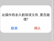
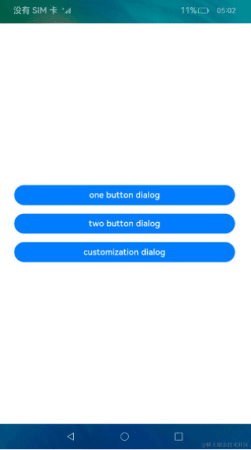
消息确认弹窗
首先看下效果:
首先先定义一个新的组件 ConfirmDialog:
@CustomDialog
exportdefaultstructConfirmDialog{
title:string=''
content:string=''
confirmFontColor:string='#E84026'
cancelFontColor:string='#0A59F7'
confirmText:string='确认'
cancelText:string='取消'
controller:CustomDialogController
cancel:()=>void
confirm:()=>void
build(){}
}
自定义确认弹窗可自定义传入的参数有:
-
可选参数:标题 title(默认值:“”),正文内容 content(默认值:“”),确认按钮字体颜色 confirmFontColor(默认值:#E84026),取消按钮字体颜色 cancelFontColor(默认值:#0A59F7),确认按钮文案(默认值:确认),取消按钮文案(默认值:取消)
-
必须参数:自定义弹窗控制器 controller: CustomDialogController,确认按钮触发事件 confirm(),取消按钮触发事件 cancel()
标题、正文、按钮封装:一个确认弹窗组件主要由标题、正文等文本内容和取消、确认等按钮事件组成。下面将分别对文案和按钮通过**@Extend**装饰器进行封装。
@Extend 装饰器将新的属性函数添加到内置组件上,如 Text、Column、Button 等。通过**@Extend**装饰器可以快速定义并复用组件的自定义样式。

//标题title与正文content自定义样式
@Extend(Text)functionfancfontSize(fontSize:number){
.fontSize(fontSize)
.width('100%')
.fontColor('rgba(0,0,0,0.86)')
.textAlign(TextAlign.Center)
.padding({top:15,bottom:0,left:8,right:8})
.alignSelf(ItemAlign.Center)
.margin({top:16})
}

//取消、确认按钮自定义样式
@Extend(Text)functionfancBtn(fontColor:string){
.fontColor(fontColor)
.backgroundColor(0xffffff)
.width(188)
.height(29)
.fontSize(22)
.textAlign(TextAlign.Center)
}
本示例仅标题与正文仅支持字体大小 fontSize 自定义,按钮仅支持按钮文案字体颜色 fontColor 自定义,其他通用属性皆是写定的,若想支持其他属性自定义,也可通过 fancfontSize() 添加新的参数。
其次,可以更进一步的对标题与正文通过 @Builder 装饰器进行封装,且通过是否传入 title、content 字段来判断是否展示对应文案。
@Builder 装饰的方法用于定义组件的声明式 UI 描述,在 一个自定义组件内快速生成多个布局内容。@Builder 装饰方法的功能和语法规范与build 函数相同。
//文案样式
@BuilderTipTextStyle(tip:string,fontSize:number){
Text(tip)
.fancfontSize(fontSize)
.visibility(tip.length>0?Visibility.Visible:Visibility.None)
}
注意:
-
@Extend 装饰器的内容必须写在 ConfirmDialog{} 组件外,且在 @Extend 装饰器声明的基础内置组件的方法之前不能出现用/*多行注释(会报错),但可采用单行注释//。
-
@Builder 装饰器的内容要写在 ConfirmDialog{} 组件内,build(){} 外 。
-
@Builder 装饰器声明的自定义组件内部可包含 @Extend 声明的自定义样式的基础组件,但是 @Extend 内部不可包含 @Builder 装饰器声明的自定义组件。
ConfirmDialog 组件完整代码:
//取消、确认按钮自定义样式
@Extend(Text)functionfancBtn(fontColor:string){
.fontColor(fontColor)
.backgroundColor(0xffffff)
.width(188)
.height(29)
.fontSize(22)
.textAlign(TextAlign.Center)
}
//标题title与正文content自定义样式
@Extend(Text)functionfancfontSize(fontSize:number){
.fontSize(fontSize)
.width('100%')
.fontColor('rgba(0,0,0,0.86)')
.textAlign(TextAlign.Center)
.padding({top:15,bottom:0,left:8,right:8})
.alignSelf(ItemAlign.Center)
.margin({top:16})
}
@CustomDialog
exportdefaultstructConfirmDialog{
title:string=''
content:string=''
confirmFontColor:string='#E84026'
cancelFontColor:string='#0A59F7'
confirmText:string='确认'
cancelText:string='取消'
controller:CustomDialogController
cancel:()=>void
confirm:()=>void
//标题、正文文案样式
@BuilderTipTextStyle(tip:string,fontSize:number){
Text(tip)
.fancfontSize(fontSize)
.visibility(tip.length>0?Visibility.Visible:Visibility.None)
}

build(){
Column(){
this.TipTextStyle(this.title,28)
this.TipTextStyle(this.content,22)
Flex({justifyContent:FlexAlign.SpaceAround}){
Text(this.cancelText)
.fancBtn(this.cancelFontColor)
.onClick(()=>{
this.controller.close()
this.cancel()
})
Text(this.confirmText)
.fancBtn(this.confirmFontColor)
.onClick(()=>{
this.controller.close()
this.confirm()
})
}.margin({top:30,bottom:16,left:16,right:16})
}
}
}
引用页面代码:
importConfirmDialogfrom'./components/dialog/ConfirmDialog.ets'
@Entry
@Component
structIndexComponent{
//确认弹窗
privatetitle:string='标题'
privatecontent:string='此操作将永久删除该文件,是否继续?'
privateconfirmText:string='删除'
ConfirmDialogController:CustomDialogController=newCustomDialogController({
builder:ConfirmDialog({cancel:this.onCancel,confirm:()=>{
this.onAccept()
},title:this.title,content:this.content}),
cancel:this.onCancel,
autoCancel:true
})
//点击取消按钮或遮罩层关闭弹窗
onCancel(){
console.info('取消,关闭弹窗')
}
//点击确认弹窗
onAccept(){
console.info('确认,关闭弹窗')
}
build(){
Scroll(){
Column(){
Text('确认弹窗')
.fontSize(24)
.width(300)
.height(60)
.border({width:5,color:0x317AF7,radius:10,style:BorderStyle.Solid})
.margin({top:20,bottom:10})
.textAlign(TextAlign.Center)
.onClick(()=>{
this.ConfirmDialogController.open()
})
}
.width('100%')
}
}
}
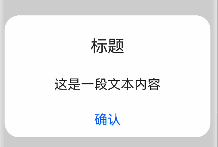
消息提示弹窗
首先看下效果:
首先先定义一个新的组件 PromptDialog:
@CustomDialog
exportdefaultstructPromptDialog{
controller:CustomDialogController
ancel:()=>void
build(){}
}
至于标题、正文、按钮文案及按钮颜色的封装均与消息确认弹窗一样,同 1.2 所述。
PromptDialog 组件完整代码:
//标题title与正文content自定义样式
@Extend(Text)functionfancfontSize(fontSize:number){
.fontSize(fontSize)
.width('100%')
.fontColor('rgba(0,0,0,0.86)')
.textAlign(TextAlign.Center)
.padding({top:15,bottom:0,left:8,right:8})
.alignSelf(ItemAlign.Center)
.margin({top:16})
}
//底部按钮自定义样式
@Extend(Text)functionfancBtn(fontColor:string){
.backgroundColor(0xffffff)
.fontColor(fontColor)
.width(188)
.height(29)
.fontSize(22)
.textAlign(TextAlign.Center)
}
@CustomDialog
exportdefaultstructPromptDialog{
controller:CustomDialogController
cancel:()=>void
//标题、正文文案样式
@BuilderTipTextStyle(tip:string,fontSize:number){
Text(tip)
.fancfontSize(fontSize)
.visibility(tip.length>0?Visibility.Visible:Visibility.None)
}
build(){
Column(){
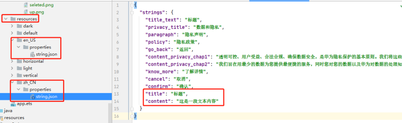
this.TipTextStyle($s('strings.title'),28)
this.TipTextStyle($s('strings.content'),22)
Flex({justifyContent:FlexAlign.Center}){
Text($s('strings.confirm'))
.fancBtn(0x0A59F7)
.onClick(()=>{
this.controller.close()
})
}.margin({top:30,bottom:16})
}
}
}
若标题 title 与正文 content 中的文案是固定的,可如此示例一样,可采用写入到 resource 中的 zh_CN 和 en_US 文件中,通过 $s(‘strings.title’) 取值显示,若是动态获取的,可采用消息确认弹窗中传参方式。
引用页面代码:
importPromptDialogfrom'./components/dialog/PromptDialog.ets'
@Entry
@Component
structIndexComponent{
//消息提示弹窗
PromptDialogController:CustomDialogController=newCustomDialogController({
builder:PromptDialog(),
autoCancel:true
})

build(){
Scroll(){
Column(){
Text('消息提示弹窗')
.fontSize(24)
.width(300)
.height(60)
.border({width:5,color:0x317AF7,radius:10,style:BorderStyle.Solid})
.margin({top:20,bottom:10})
.textAlign(TextAlign.Center)
.onClick(()=>{
this.PromptDialogController.open()
})
}
.width('100%')
}
}
}
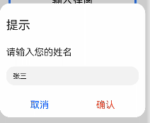
消息输入弹窗
首先看下效果:
首先先定义一个新的组件 InputDialog:
exportdefaultstructInputDialog{
title:string=''
content:string=''
@StateinputString:string=''
controller:CustomDialogController
cancel:()=>void
confirm:(data)=>void

build(){}
}
此示例讲述了子组件通过事件触发传参给父组件的方法,例如:在子组件用 @state 声明输入框内容 inputString,通过 confirm 事件传参给父组件,可支持在父组件至于标题、正文、按钮文案及按钮颜色的封装均与消息确认弹窗一样,同 1.2 所述。
PromptDialog 组件完整代码:
//取消、确认按钮自定义样式
@Extend(Text)functionfancBtn(fontColor:string){
.fontColor(fontColor)
.backgroundColor(0xffffff)
.width(188)
.height(29)
.fontSize(22)
.textAlign(TextAlign.Center)
}
//标题title与正文content自定义样式
@Extend(Text)functionfancfontSize(fontSize:number){
.fontSize(fontSize)
.width('100%')
.fontColor('rgba(0,0,0,0.86)')
.textAlign(TextAlign.Start)
.padding({top:15,bottom:0,left:15,right:15})
.margin({top:16})
}
@CustomDialog
exportdefaultstructInputDialog{
title:string=''
content:string=''
@StateinputString:string=''
controller:CustomDialogController
cancel:()=>void
confirm:(data)=>void
//文案样式
@BuilderTipTextStyle(tip:string,fontSize:number){
Text(tip)
.fancfontSize(fontSize)
.visibility(tip.length>0?Visibility.Visible:Visibility.None)
}

build(){
Column(){
this.TipTextStyle(this.title,28)
this.TipTextStyle(this.content,22)
//输入框
TextInput()
.type(InputType.Normal)
.enterKeyType(EnterKeyType.Next)
.caretColor(Color.Green)
.height(44)
.margin({top:20,left:15;right:15})
.alignSelf(ItemAlign.Center)
.onChange((value:string)=>{
this.inputString=value
})
Flex({justifyContent:FlexAlign.SpaceAround}){
Text($s('strings.cancel'))
.fancBtn('#0A59F7')
.onClick(()=>{
this.controller.close()
this.cancel()
})
Text($s('strings.confirm'))
.fancBtn('#E84026')
.onClick(()=>{
this.controller.close()
console.log('inputString:'+this.inputString)
this.confirm(this.inputString)
})
}.margin({top:30,bottom:16,left:16,right:16})
}
}
}

引用页面代码:
importInputDialogfrom'./components/dialog/InputDialog.ets'
@Entry
@Component
structIndexComponent{

//输入弹窗
privatetext:string='提示'
privatelabel:string='请输入您的姓名'
InputDialogController:CustomDialogController=newCustomDialogController({
builder:InputDialog({cancel:this.onCancel,confirm:(data)=>{
this.confirm(data)
},title:this.text,content:this.label}),
cancel:this.onCancel,
autoCancel:true
})
//点击取消按钮或遮罩层关闭弹窗
onCancel(){
console.info('取消,关闭输入弹窗')
}
//点击确认弹窗
confirm(data){
console.info('确认,关闭输入弹窗,data:'+data)
}

build(){
Scroll(){
Column(){
Text('输入弹窗')
.fontSize(24)
.width(300)
.height(60)
.border({width:5,color:0x317AF7,radius:10,style:BorderStyle.Solid})
.margin({top:20,bottom:10})
.textAlign(TextAlign.Center)
.onClick(()=>{
this.InputDialogController.open()
})
}
.width('100%')
}
}
}
总结
本文仅仅实现了三种自定义弹窗 UI 组件的封装(传参方式也讲解了多种,具体传参方式可视具体情况而定),待笔者优化了功能、代码后在来与大家分享, 在最后欢迎鸿蒙各位大佬指教。
原文标题:在鸿蒙上实现3种自定义弹窗UI组件封装
文章出处:【微信公众号:HarmonyOS技术社区】欢迎添加关注!文章转载请注明出处。
-
封装
+关注
关注
128文章
9337浏览量
149057 -
组件
+关注
关注
1文章
603浏览量
19068 -
鸿蒙
+关注
关注
60文章
3026浏览量
46179
原文标题:在鸿蒙上实现3种自定义弹窗UI组件封装
文章出处:【微信号:gh_834c4b3d87fe,微信公众号:OpenHarmony技术社区】欢迎添加关注!文章转载请注明出处。
发布评论请先 登录

深度解读HarmonyOS自定义UI组件的使用
鸿蒙上自定义组件的过程
OpenHarmony自定义组件FlowImageLayout
OpenHarmony自定义组件CircleProgress


评论