 鸿蒙OS开发:【一次开发,多端部署】(app市场首页)

应用市场首页
本小节将以应用市场首页为例,介绍如何使用自适应布局能力和响应式布局能力适配不同尺寸窗口。
页面设计
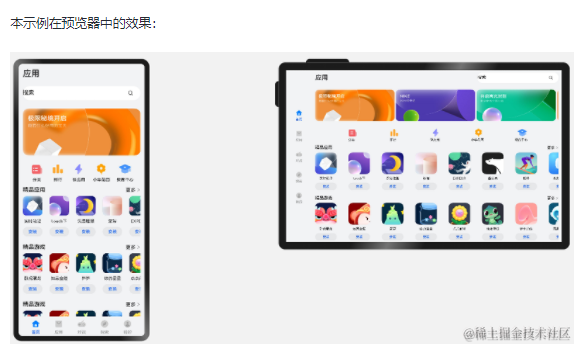
一个典型的应用市场首页的UX设计如下所示。
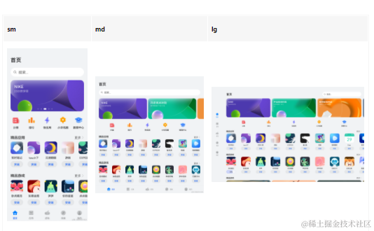
观察应用市场首页的页面设计,不同断点下的页面设计有较多相似的地方。
据此,我们可以将页面分拆为多个组成部分。
- 底部/侧边导航栏
- 标题栏与搜索栏
- 运营横幅
- 快捷入口
- 精品应用
- 开发前请熟悉鸿蒙开发指导文档 :[gitee.com/li-shizhen-skin/harmony-os/blob/master/README.md]点击或者复制转到。

接下来我们逐一分析各部分的实现。
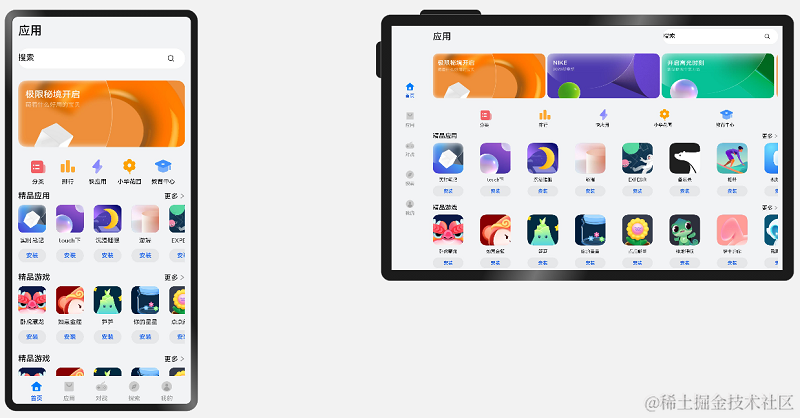
底部/侧边导航栏
在sm和md断点下,导航栏在底部;在lg断点下,导航栏在左侧。可以通过[Tab组件]的barPosition和vertical属性控制TabBar的位置,同时还可以通过barWidth和barHeight属性控制TabBar的尺寸。
import Home from '../common/Home';//组件请参考相关实例
import TabBarItem from '../common/TabBarItem';

@Entry
@Component
struct Index {
  @State currentIndex: number = 0;
  @StorageProp('currentBreakpoint') currentBreakpoint: string = 'md';
  @Builder
  tabItem(index: number, title: Resource, icon: Resource, iconSelected: Resource) {
    TabBarItem({
      index: index,
      currentIndex: this.currentIndex,
      title: title,
      icon: icon,
      iconSelected: iconSelected
    })
  }

  build() {
    // 设置TabBar在主轴方向起始或结尾位置
    Tabs({ barPosition: this.currentBreakpoint === "lg" ? BarPosition.Start : BarPosition.End }) {
      // 首页
      TabContent() {
        Home()
      }.tabBar(this.tabItem(0, $r('app.string.tabBar1'), $r('app.media.ic_home_normal'), $r('app.media.ic_home_actived')))
      TabContent() {}.tabBar(this.tabItem(1, $r('app.string.tabBar2'), $r('app.media.ic_app_normal'), $r('app.media.ic_app_actived')))
      TabContent() {}.tabBar(this.tabItem(2, $r('app.string.tabBar3'), $r('app.media.ic_game_normal'), $r('app.media.ic_mine_actived')))
      TabContent() {}.tabBar(this.tabItem(3, $r('app.string.tabBar4'), $r('app.media.ic_search_normal'), $r('app.media.ic_search_actived')))
      TabContent() {}.tabBar(this.tabItem(4, $r('app.string.tabBar4'), $r('app.media.ic_mine_normal'), $r('app.media.ic_mine_actived')))
    }
    .backgroundColor('#F1F3F5')
    .barMode(BarMode.Fixed)
    .barWidth(this.currentBreakpoint === "lg" ? 96 : '100%')
    .barHeight(this.currentBreakpoint === "lg" ? '60%' : 56)
    // 设置TabBar放置在水平或垂直方向
    .vertical(this.currentBreakpoint === "lg")
  }
}
另外在sm及lg断点下,TabBar中各个Item的图标和文字是按照垂直方向排布的,在md断点下,TabBar中各个Item的图标和文字是按照水平方向排布的。
@Component
export default struct TabBarItem {
  @StorageProp('currentBreakpoint') currentBreakpoint: string = 'md';

  build() {
    if (this.currentBreakpoint !== 'md' ) {
      // sm及lg断点下,tabBarItem中的图标和文字垂直排布
      Column() {
       // ...
      }.justifyContent(FlexAlign.Center).height('100%').width('100%')
    } else {
      // md断点下,tabBarItem中的图标和文字水平排布
      Row() {
       // ...
      }.justifyContent(FlexAlign.Center).height('100%').width('100%')
    }
  }
}
标题栏与搜索栏
标题栏和搜索栏,在sm和md断点下分两行显示,在lg断点下单行显示,可以通过栅格实现。在sm和md断点下,标题栏和搜索栏占满12列,此时会自动换行显示。在lg断点下,标题栏占8列而搜索栏占4列,此时标题栏和搜索栏在同一行中显示。

@Component
export default struct IndexHeader {

  @Builder searchBar() {
    Stack({alignContent: Alignment.End}) {
      TextInput({ placeholder: $r('app.string.search') })
        .placeholderColor('#FF000000')
        .placeholderFont({ size: 16, weight: 400 })
        .textAlign(TextAlign.Start)
        .caretColor('#FF000000')
        .width('100%')
        .height(40)
        .fontWeight(400)
        .padding({ top: 9, bottom: 9 })
        .fontSize(16)
        .backgroundColor(Color.White)

      Image($r('app.media.ic_public_search'))
        .width(16)
        .height(16)
        .margin({ right: 20 })
    }.height(56).width('100%')
  }

  @Builder titleBar() {
    Text($r('app.string.tabBar1'))
      .fontSize(24)
      .fontWeight(500)
      .fontColor('#18181A')
      .textAlign(TextAlign.Start)
      .height(56)
      .width('100%')
  }

  build() {
    // 借助栅格实现标题栏和搜索栏在不同断点下的不同布局效果。
    GridRow() {
      GridCol({ span: { xs: 12, lg: 8 } }) {
        this.titleBar()
      }
      GridCol({ span: { xs: 12, lg: 4 } }) {
        this.searchBar()
      }
    }
    .width('100%')
  }
}
运营横幅
不同断点下的运营横幅,sm断点下显示一张图片,md断点下显示两张图片,lg断点下显示三张图片。可以通过[Swiper组件的displayCount属性]实现目标效果。
@Component
export default struct IndexSwiper {
  @StorageProp('currentBreakpoint') currentBreakpoint: string = 'md';
  @Builder swiperItem(imageSrc:Resource) {
    Image(imageSrc)
      .width('100%')
      .aspectRatio(2.5)
      .objectFit(ImageFit.Fill)
  }

  build() {
    Swiper() {
      this.swiperItem($r('app.media.ic_public_swiper1'))
      this.swiperItem($r('app.media.ic_public_swiper2'))
      this.swiperItem($r('app.media.ic_public_swiper3'))
      // ...
    }
    .autoPlay(true)
    .indicator(false)
    .itemSpace(10)
    // 配置不同断点下运行横幅中展示的图片数量
    .displayCount(this.currentBreakpoint === 'sm' ? 1 : (this.currentBreakpoint === 'md' ? 2 : 3))
    .width('100%')
    .padding({ left: 12, right: 12, bottom: 16, top: 16 })
  }
}
快捷入口
在不同的断点下,快捷入口的5个图标始终均匀排布,这是典型的均分能力使用场景。
import { entranceIcons } from '../model/HomeData';
import { AllIcons } from '../model/HomeDataType';

@Component
export default struct IndexEntrance {
  build() {
    // 将justifyContent参数配置为FlexAlign.SpaceEvenly实现均分布局
    Row() {
      ForEach(entranceIcons, (icon: AllIcons) = > {
        // 各快捷入口的图标及名称
        Column() {
          // ...
          }
      })
    }
    .width('100%')
    .height(64)
    .justifyContent(FlexAlign.SpaceEvenly)
    .padding({ left: 12, right: 12 })
  }
}
精品应用
随着可用显示区域的增加,精品应用中显示的图标数量也不断增加,这是典型的延伸能力使用场景。精品游戏的实现与精品应用类似,不再展开分析。
import { AppItem, MyAppSource } from '../model/HomeDataType';

@Component
export default struct IndexApps {
  private title?: Resource;
  @StorageProp('currentBreakpoint') currentBreakpoint: string = 'md';
  private apps: AppItem[] = [];
  @Builder
  appListHeader() {
    Row() {
      Text(this.title)
        .width(100)
        .fontSize(16)
        .textAlign(TextAlign.Start)
        .fontWeight(500)
      Blank()
      Text($r('app.string.more'))
        .fontSize(14)
        .textAlign(TextAlign.End)
        .fontWeight(400)
        .margin({ right: 2 })
      Image($r('app.media.ic_public_arrow_right'))
        .width(12)
        .height(18)
        .opacity(0.9)
        .objectFit(ImageFit.Fill)
    }
    .margin({ bottom: 9, top: 9 })
    .width('100%')
    .alignItems(VerticalAlign.Bottom)
  }

  @Builder
  appListItem(app:AppItem) {
    Column() {
      Image(app.image)
        .width(this.currentBreakpoint === 'lg' ? 80 : 56)
        .height(this.currentBreakpoint === 'lg' ? 80 : 56)
        .margin({ bottom: 8 })
      Text(app.title)
        .width(this.currentBreakpoint === 'lg' ? 80 : 56)
        .height(16)
        .fontSize(12)
        .textAlign(TextAlign.Center)
        .fontColor('#18181A')
        .margin({ bottom: 8 })
      Text($r('app.string.install'))
        .width(this.currentBreakpoint === 'lg' ? 80 : 56)
        .height(28)
        .fontColor('#0A59F7')
        .textAlign(TextAlign.Center)
        .borderRadius(this.currentBreakpoint === 'lg' ? 26 : 20)
        .fontWeight(500)
        .fontSize(12)
        .padding({ top: 6, bottom: 6, left: 8, right: 8 })
        .backgroundColor('rgba(0,0,0,0.05)')
    }
  }
  build() {
    Column() {
      this.appListHeader()
      // 借助List组件能力,实现延伸能力场景
      List({ space: this.currentBreakpoint === 'lg' ? 44 : 20}) {
        LazyForEach(new MyAppSource(this.apps), (app: AppItem)= > {
          ListItem() {
            // 每个应用的图标、名称及安装按钮
            this.appListItem(app)
          }
        })
      }
      .width('100%')
      .height(this.currentBreakpoint === 'lg' ? 140 : 120)
      .listDirection(Axis.Horizontal)
    }
    .width('100%')
    .height(this.currentBreakpoint === 'lg' ? 188 : 164)
    .padding({ bottom: 8, left: 12, right: 12 })
  }
}
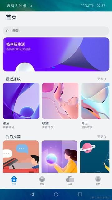
运行效果
将上述各页面主要部分组合在一起后,即可完成整体页面开发。
import IndexSwiper from './IndexSwiper';
import IndexEntrance from './IndexEntrance';
import IndexApps from './IndexApps';
import { appList, gameList } from '../model/HomeData';
import IndexHeader from './IndexHeader';

@Component
struct IndexContent {
  // ...
  build() {
    List() {
      // 运营横幅
      ListItem() {
        IndexSwiper()
      }
      // 快捷入口
      ListItem() {
        IndexEntrance()
      }
      // 精品应用
      ListItem() {
        IndexApps({ title: $r('app.string.boutique_application'), apps: appList })
      }
      // 精品游戏
      ListItem() {
        IndexApps({ title: $r('app.string.boutique_game'), apps: gameList })
      }
    }
    .width("100%")
  }
}

@Entry
@Component
export default struct Home {
  // ...
  build() {
    Flex({ direction: FlexDirection.Column, justifyContent: FlexAlign.Start, alignItems: ItemAlign.Start }) {
      // 标题栏和搜索栏
      IndexHeader()
      // 运营横幅、快捷入口、精品应用、精品游戏等
      IndexContent()
    }
    .height('100%')
    .backgroundColor("#F1F3F5")
  }
}

`HarmonyOS与OpenHarmony鸿蒙文档籽料:mau123789是v直接拿`
本页面的实际运行效果如下图所示。

声明:本文内容及配图由入驻作者撰写或者入驻合作网站授权转载。文章观点仅代表作者本人,不代表电子发烧友网立场。文章及其配图仅供工程师学习之用,如有内容侵权或者其他违规问题,请联系本站处理。
举报投诉
-
移动开发
+关注
关注
0文章
52浏览量
11206 -
鸿蒙系统
+关注
关注
183文章
2642浏览量
70144 -
HarmonyOS
+关注
关注
80文章
2157浏览量
36321 -
OpenHarmony
+关注
关注
33文章
3977浏览量
21378 -
鸿蒙OS
+关注
关注
0文章
194浏览量
5558
发布评论请先 登录
相关推荐
热点推荐
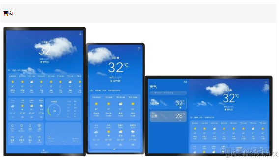
鸿蒙OS开发:【一次开发,多端部署】(一多天气)项目
本示例展示一个天气应用界面,包括首页、城市管理、添加城市、更新时间弹窗,体现一次开发,多端部署的
鸿蒙OS开发:【一次开发,多端部署】(音乐专辑主页)
本示例使用一次开发多端部署中介绍的自适应布局能力和响应式布局能力进行多设备(或多窗口尺寸)适配,保证应用在不同设备或不同窗口尺寸下可以正常显示。
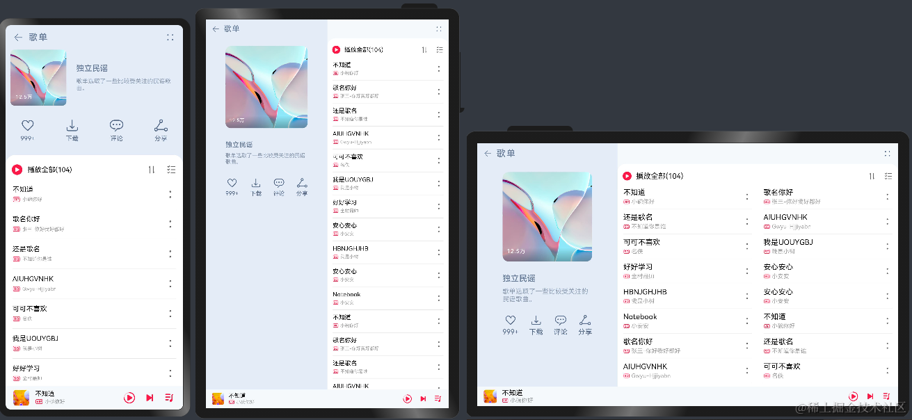
鸿蒙OS开发:典型页面场景【一次开发,多端部署】实战(音乐专辑页2)
本示例使用[一次开发多端部署]中介绍的自适应布局能力和响应式布局能力进行多设备(或多窗口尺寸)适配,保证应用在不同设备或不同窗口尺寸下可以正常显示。
鸿蒙OS开发:典型页面场景【一次开发,多端部署】实战(设置典型页面)
本示例展示了设置应用的典型页面,其在小窗口和大窗口有不同的显示效果,体现一次开发、多端部署的能力。
HarmonyOS\"一次开发,多端部署\"优秀实践——玩机技巧,码上起航
的潜在用户群体。一个应用要在多类设备上提供统一的内容,需要适配不同的屏幕尺寸和硬件,开发成本较高。\"一次开发,
发表于 08-30 18:14

华为开发者大会2021:软件部总裁龚体 鸿蒙系统 一次开发 多端部署 万物互连
华为开发者大会2021:鸿蒙系统 一次开发 多端部署 万物互连 在华为

鸿蒙OS开发:【一次开发,多端部署】(多设备自适应能力)简单介绍
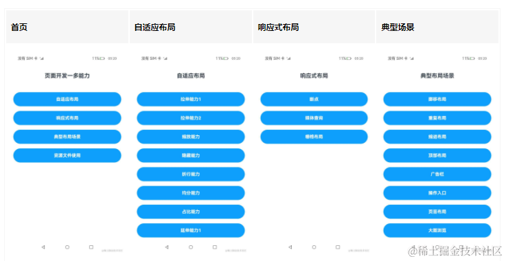
本示例是《一次开发,多端部署》的配套示例代码,展示了[页面开发的一多能力],包括自适应布局、响应
鸿蒙OS开发:【一次开发,多端部署】( 设置app页面)
本示例展示了设置应用的典型页面,其在小窗口和大窗口有不同的显示效果,体现一次开发、多端部署的能力。


评论