 HarmonyOS基于 ArkUI 中 TS 扩展声明式开发范式

本来计划要做一个本地数据库存储相关的项目,但是官方的小伙伴给我说,ArkUI 数据库目前不支持最新的模拟器,所以只能另想其他的。
想了大概一周,期间也在调研技术能否实现,最终定了这个项目,真正的敲代码开发大概就用了一天,最难的就是想法和界面设计。
不得不感慨新框架真的方便、真的好用!期待下个版本能完善组件和 API 的细节。也希望 HarmonyOS 越来越好。
界面搭建基于 ArkUI 中 TS 扩展的声明式开发范式,关于语法和概念直接看官网官方文档地址。
基于 TS 扩展的声明式开发范式 1:
https://developer.harmonyos.com/cn/docs/documentation/doc-guides/ui-ts-overview-0000001192705715基于 TS 扩展的声明式开发范式 2:
https://developer.harmonyos.com/cn/docs/documentation/doc-references/ts-framework-directory-0000001111581264
项目说明
使用系统自带的网络请求框架,根据 Tab 的类型切换请求对应的数据。列表支持下拉刷新、上拉加载更多。
模拟登录效果,根据输入框来确定按钮是否启用,登录成功后,显示登录头像和用户信息。
①数据请求:聚合免费 API-新闻头条
https://www.juhe.cn/docs/api/id/235②网络请求:1-官方文档、2-ArkUI 开发基础:网络请求
https://developer.harmonyos.com/cn/docs/documentation/doc-references/js-apis-net-http-0000001168304341 https://developer.huawei.com/consumer/cn/forum/topic/0203723866728880326?fid=0101591351254000314③列表刷新:ArkUI(TS)声明式开发:列表下拉刷新、上拉加载更多
https://developer.huawei.com/consumer/cn/forum/topic/0203729154661360497?fid=0101591351254000314
效果演示
在远程模拟器录制的,效果不佳:
功能解析
①首页
首页从上至下分为三个部分:
标题栏
Tab 标签
数据列表
标题栏:布局很简单,使用 Row 布局包裹:Image 和 Swiper(搜索框中文字上下切换)。
部分代码:
......
//标题栏
@BuilderCustomTitleBar(){
Row(){
//头像
Image(this.isLogin?$r('app.media.ic_ldd_headpic'):$r('app.media.ic_default_headpic'))
.width(30)
.height(30)
.borderRadius(15)
.margin({right:10})
.onClick(()=>{
this.openSideMenu()
})

//搜索框
Row(){
//搜索图标
Image($r('app.media.ic_search'))
.width(15).height(15)
.margin({left:10})

//视图上下切换
Swiper(){
ForEach(this.listSearch,item=>{
Text(item)
.height('100%')
.fontSize(12)
.fontColor('#505050')
.margin({left:10})
},item=>item)
}
.vertical(true)//方向:纵向
.autoPlay(true)//自动播放
.indicator(false)//隐藏指示器
.interval(3000)//切换间隔时间3秒
}
.layoutWeight(1)
.height('100%')
.backgroundColor('#F1F1F1')
.borderRadius(15)
}
.width('100%')
.height(50)
.backgroundColor(Color.White)
.padding({top:10,bottom:10,left:15,right:15})
}
......
Tab 标签:这个也比较简单,根据屏幕宽度、tab 标签的总数量,就能得出 tabItem 的宽度。
底部设置的指示器,点击 tab 根据 index(当前索引) * itemWithd(每个 tab 的宽度)设置属性动画,切换效果就可以了。
import{TabModel,getTabList}from'../../model/tabModel.ets';
importdisplayfrom'@ohos.display';
@Component
exportstructHomeTabs{
//Tab数据
privatelistTab=getTabList()
//tabItem平均宽度
@StatetabIndicatorWidth:number=152
//指示器
@StatetabIndex:number=0
//对外暴露的方法
privatetabClick:(item:TabModel)=>void

privateaboutToAppear(){
display.getDefaultDisplay((err,data)=>{
if(!err){
//获取tabItem平均宽度
this.tabIndicatorWidth=data.width/this.listTab.length
}
})
}

build(){
Column(){
Stack({alignContent:Alignment.Bottom}){
//tab内容
Row(){
ForEach(this.listTab,item=>{
Button(){
Text(item.name)
.fontSize(this.tabIndex==item.id?15:13)//根据当前选中改变字体大小
.fontColor(this.tabIndex==item.id?$r('app.color.app_theme'):'#000000')//根据当前选中改变字体颜色
}
.layoutWeight(1)
.height(35)
.type(ButtonType.Normal)
.backgroundColor(Color.White)
.onClick(()=>{
this.tabIndex=item.id//更新索引
this.tabClick(item)//提供给外部调用
})
},item=>item.tabType)
}.height(35)

//指示器
Row(){
Divider()
.width(`${this.tabIndicatorWidth}px`)//平均宽度
.strokeWidth(3)
.color($r('app.color.app_theme'))
.lineCap(LineCapStyle.Round)//圆角
.padding({left:10,right:10})
.offset({x:`${this.tabIndex*this.tabIndicatorWidth}px`,y:0})//改变偏移量
.animation({duration:300})//属性动画
}.width('100%')
}.backgroundColor(Color.White)
Divider().color('#e8e8e8')
}
}
}
数据列表:根据数据的不同,展示的 item 的布局样式也不同,分为两种情况:单张图片和多张图片,下拉刷新和加载更多功能看我之前的写的帖子。
部分代码:
......
List(){
ForEach(this.listNews,(item:NewsData)=>{
ListItem(){
Column(){
//根据数据,展示不同的布局样式
if(item.thumbnail_pic_s02==undefined){
//单张图片样式
this.ItemSinglePic(item)
}else{
//多张图片样式
this.ItemMorePic(item)
}
}.width('100%')
}.padding(10)
},item=>item.uniquekey)
}
.divider({strokeWidth:1,color:'#f5f5f5'})
......
②侧边栏
侧边栏没有加入手势控制,只是简单的点击头像动画打开、点击阴影部分动画关闭,默认关闭状态。
从以下代码看下,只需要设置值,设置属性动画之后,侧边栏动画效果就出来了,也是很方便的。
@Entry
@Component
structMainPage{
//屏幕宽度
privatescreenWidth=0
//侧边栏的x位置
@StatesideBarX:number=-2000
//侧边栏背景的透明度
@StatesideBarBgopacity:number=0
//侧边栏背景显示值
@StatesideBarBgVisibility:Visibility=Visibility.Hidden

privateaboutToAppear(){
display.getDefaultDisplay((err,data)=>{
if(!err){
//获取屏幕宽度
this.screenWidth=data.width
//设置侧边栏偏移量:负屏幕宽度
this.sideBarX=-this.screenWidth
}
})
}

//打开侧边栏
privateopenSideMenu(){
this.sideBarX=0
this.sideBarBgopacity=1
this.sideBarBgVisibility=Visibility.Visible
}

//关闭侧边栏
privatecloseSideMenu(){
this.sideBarX=-this.screenWidth
this.sideBarBgopacity=0
}

build(){
Stack(){
Column(){
//主页界面
}

//半透明背景
Stack()
.width('100%')
.height('100%')
.backgroundColor('#80000000')
.opacity(this.sideBarBgopacity)
.animation({//属性动画,当透明度为0,隐藏背景
duration:300,
onFinish:()=>{
if(this.sideBarBgopacity==0){
this.sideBarBgVisibility=Visibility.Hidden
}
}
})
.visibility(this.sideBarBgVisibility)

//侧边栏
Row(){
Column(){
SideMenu({isLogin:$isLogin,closeMenu:()=>{
this.closeSideMenu()//侧边栏布局
}})
}
.width('70%')
.height('100%')
.backgroundColor(Color.White)

Blank().onClick(()=>{
this.closeSideMenu()
})
}
.width('100%')
.height('100%')
.position({x:`${this.sideBarX}px`,y:0})//动态改变位置
.animation({duration:300})//属性动画
}
.width('100%')
.height('100%')
}
}
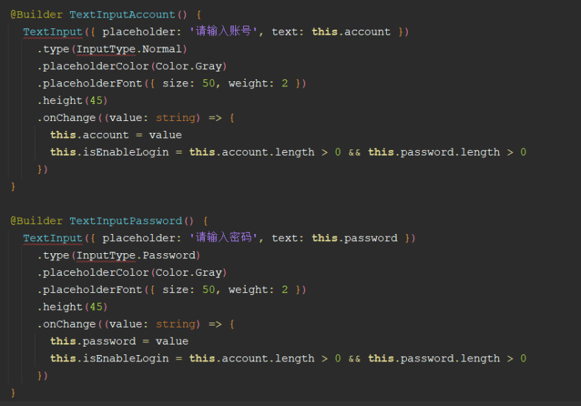
③登录
登录也比较简单,只不过目前官网没有输入框的文档资料,这个输入框还是我从Codelabs:流式布局(eTS)上面看到的。根据输入框是否有内容判断按钮的启用状态。
虽然粘贴到编辑器中代码提示有错,但是可以正常运行和预览。密码框的类型还是我猜的!哈哈,就猜对了。
④保存登录状态
根据官网资料:轻量级存储、官网示例还是有问题。
https://developer.harmonyos.com/cn/docs/documentation/doc-references/js-apis-data-storage-0000001117163542
我是问了华为的小伙伴,他给我说这个路径需要在 /data/data/,但是目前模拟器对这块功能还兼容的不完善,不能持久化,如果把程序后台杀死,数据就没了。
importdataStoragefrom'@ohos.data.storage';
//设置存储的路径,路径必须在/data/data/下
constSTORAGE_PATH='/data/data/info'

exportclassInfoStorage{
//保存用户ID
setUserId(userId:string){
letstore=dataStorage.getStorageSync(STORAGE_PATH)
store.putSync('userId',userId)
}

//获取用户ID
getUserId(){
letstore=dataStorage.getStorageSync(STORAGE_PATH)
returnstore.getSync('userId','').toString()
}

}
项目地址如下(需要登录才能看到演示图):
https://gitee.com/liangdidi/NewsDemo.git
作者:梁青松
原文标题:HarmonyOS版“新闻头条”APP开发实战
文章出处:【微信公众号:HarmonyOS技术社区】欢迎添加关注!文章转载请注明出处。
-
数据库
+关注
关注
7文章
4082浏览量
68538 -
代码
+关注
关注
30文章
4976浏览量
74373 -
HarmonyOS
+关注
关注
80文章
2157浏览量
36287
原文标题:HarmonyOS版“新闻头条”APP开发实战
文章出处:【微信号:gh_834c4b3d87fe,微信公众号:OpenHarmony技术社区】欢迎添加关注!文章转载请注明出处。
发布评论请先 登录
HarmonyOS开发ArkUI案例:【常用布局容器对齐方式】


评论