 OpenHarmony DaYu200开发板示例 鸿蒙智联汽车【1.0】

应用场景:
智慧出行。
智能汽车是集环境感知、规划决策、多等级辅助驾驶等功能于一体的智能网联综合系统,它集中运用了计算机、现代传感、信息融合、通讯、人工智能及自动控制等技术,是典型的高新技术综合体。简单的说,智能汽车的出现将逐步放松车、手、眼,让开车,用车变得简单。这样的产品对有本儿不敢上路的人来说或许是大大的福音。
在北方冬天有点冷,这个时候,去车里,温度很低,给人一种不舒服的感觉,那么有没有一种可能,就是可以通过手机App,实现对车内的一些情况的监测,答案是有的,今天做的这个App,就是这样一个App。
我要实现的功能主要有
用户可以解锁任何车门,
检查电池状态,
控制空调温度,
检查轮胎的气压。
在开始之前大家可以先预览一下我完成之后的效果。如下图所示:
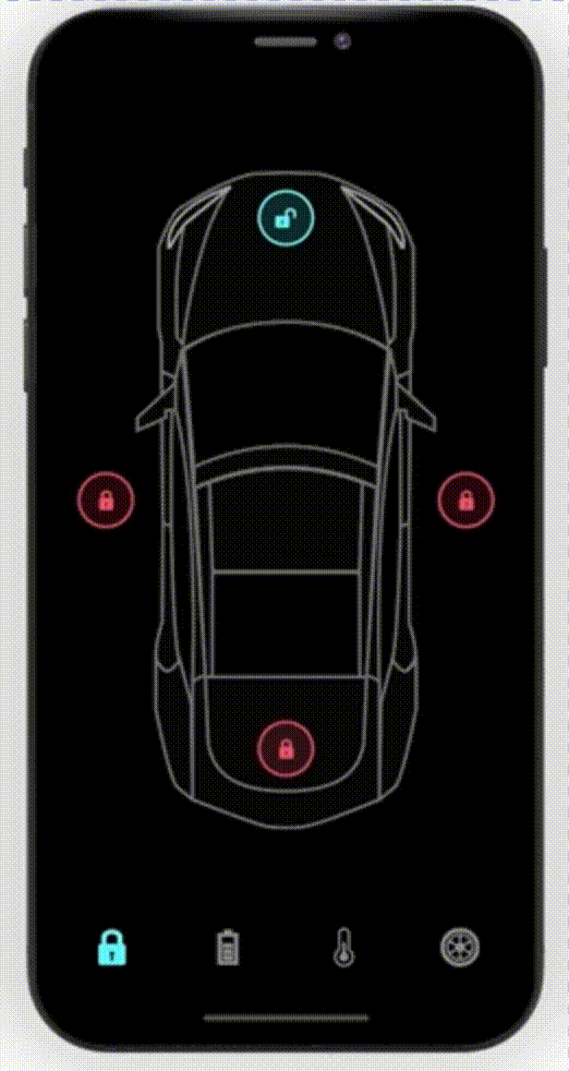
是不是很炫酷呢?
搭建OpenHarmony环境
完成本篇Codelab我们首先要完成开发环境的搭建,本示例以DaYu200开发板为例,参照以下步骤进行:
获取OpenHarmony系统版本:标准系统解决方案(二进制)
以3.0版本为例:
搭建烧录环境
完成DevEco Device Tool的安装
完成Dayu200开发板的烧录
搭建开发环境
开始前请参考工具准备 ,完成DevEco Studio的安装和开发环境配置。
开发环境配置完成后,请参考使用工程向导 创建工程(模板选择“Empty Ability”),选择eTS语言开发。
工程创建完成后,选择使用真机进行调测 。
相关概念
容器组件
Column
Row
Stack
基础组件
Text
Button
Image
Navigation
通用
边框设置
尺寸设置
点击控制
布局约束
背景设置
点击事件
TS语法糖
好的接下来我将详细讲解如何制作
开发教学
创建好的 eTS工程目录
新建工程的ETS目录如下图所示。
各个文件夹和文件的作用:
index.ets:用于描述UI布局、样式、事件交互和页面逻辑。
app.ets:用于全局应用逻辑和应用生命周期管理。
pages:用于存放所有组件页面。
resources:用于存放资源配置文件。
接下来开始正文。
我们的主要操作都是在在pages目录中,然后我将用不到10分钟的时间,带大家实现这个功能。
拆解
根据设计图,我们可以分为内容展示区和菜单。
针对这一点,我们可以用Navigation组件作为Page页面的根容器,通过属性设置来展示页面的标题、工具栏、菜单。
Navigation
() {
Column
({
space
:
20
}) {
if
(
this
.
index
==
0
)
DoorLook
()
else
if
(
this
.
index
==
1
)
Battery
()
else
if
(
this
.
index
==
2
)
Temp
()
else
if
(
this
.
index
==
3
)
Tyre
()
}
.
backgroundColor
(
Color
.
Black
)
.
justifyContent
(
FlexAlign
.
SpaceAround
)
.
alignItems
(
HorizontalAlign
.
Center
)
.
justifyContent
(
FlexAlign
.
Center
)
.
size
({
width
:
'100%'
,
height
:
'100%'
})
} .
size
({
width
:
'100%'
,
height
:
'100%'
})
.
toolBar
(
this
.
toolbarWidget
())
.
hideToolBar
(
this
.
hideToolBar
)
.
hideTitleBar
(
this
.
hideTitleBar
)
具体布局
具体布局设计到一些细节的地方,例如间隔,边框,当前组件尺寸设置等一些特殊情况,基本上就是嵌套,一层一层去实现。
代码结构
编码
Index.ets
import
Tyre
from
'./tyre_page'
;
import
Temp
from
'./temp_page'
;
import
Battery
from
'./battery_page'
;
import
DoorLook
from
'./door_lock_page'
;
@
Entry
@
Component
struct
ComponentTest
{
@
State
index
:
number
=
0
;
// 选项卡下标,默认为第一个
@
State
hideToolBar
:
boolean
=
false
;
@
State
hideTitleBar
:
boolean
=
true
;
private
imageArray
:
string
[]
=
[
'app.media.Lock'
,
'app.media.Charge'
,
'app.media.Temp'
,
'app.media.Tyre'
,];
// 数据源
@
Builder
toolbarWidget
() {
// 通过builder自定义toolbar
Row
() {
Column
() {
Image
(
this
.
index
==
0
?
$r
(
'app.media.lock'
):
$r
(
'app.media.lock0'
) )
.
size
({
width
:
36
,
height
:
36
}).
margin
({
bottom
:
4
,
top
:
12
})
}
.
alignItems
(
HorizontalAlign
.
Center
)
.
height
(
'100%'
)
.
layoutWeight
(
1
)
.
onClick
(()
=>
{
this
.
index
=
0
;
})
Column
() {
Image
(
this
.
index
==
1
?
$r
(
'app.media.battery'
):
$r
(
"app.media.battery0"
))
.
size
({
width
:
36
,
height
:
36
}).
margin
({
bottom
:
4
,
top
:
12
})
}
.
alignItems
(
HorizontalAlign
.
Center
)
.
height
(
'100%'
)
.
layoutWeight
(
1
)
.
onClick
(()
=>
{
this
.
index
=
1
;
})
Column
() {
Image
(
this
.
index
==
2
?
$r
(
'app.media.yytemp'
):
$r
(
'app.media.yytem0'
))
.
size
({
width
:
36
,
height
:
36
}).
margin
({
bottom
:
4
,
top
:
12
})
}
.
alignItems
(
HorizontalAlign
.
Center
)
.
height
(
'100%'
)
.
layoutWeight
(
1
)
.
onClick
(()
=>
{
this
.
index
=
2
;
})
Column
() {
Image
(
this
.
index
==
3
?
$r
(
'app.media.tyre'
):
$r
(
'app.media.tyre0'
))
.
size
({
width
:
36
,
height
:
36
}).
margin
({
bottom
:
4
,
top
:
12
})
}
.
alignItems
(
HorizontalAlign
.
Center
)
.
height
(
'100%'
)
.
layoutWeight
(
1
)
.
onClick
(()
=>
{
this
.
index
=
3
;
})
}.
backgroundColor
(
Color
.
Black
)
.
width
(
'100%'
)
.
height
(
66
)
}
build
() {
Navigation
() {
Column
({
space
:
20
}) {
//根据索引展示对应内容å
if
(
this
.
index
==
0
)
DoorLook
()
else
if
(
this
.
index
==
1
)
Battery
()
else
if
(
this
.
index
==
2
)
Temp
()
else
if
(
this
.
index
==
3
)
Tyre
()
}
.
backgroundColor
(
Color
.
Black
)
.
justifyContent
(
FlexAlign
.
SpaceAround
)
.
alignItems
(
HorizontalAlign
.
Center
)
.
justifyContent
(
FlexAlign
.
Center
)
.
size
({
width
:
'100%'
,
height
:
'100%'
})
}
.
size
({
width
:
'100%'
,
height
:
'100%'
})
.
title
(
"跟着坚果学OpenHarmony"
)
.
toolBar
(
this
.
toolbarWidget
())
//自定义底部菜单栏
.
hideToolBar
(
this
.
hideToolBar
)
.
hideTitleBar
(
this
.
hideTitleBar
)
.
menus
([
{
value
:
"关"
,
icon
:
'common/images/door_lock.svg'
,
action
: ()
=>
{
console
.
log
(
"工具栏"
)
}
},
{
value
:
"开"
,
icon
:
'common/images/door_unlock.svg'
,
action
: ()
=>
{
}
}
])
}
}
效果演示:
车锁页
@
Entry
@
Component
export
default
struct
DoorLook
{
//车锁页
@
State
isRightDoorLock
:
boolean
=
false
;
@
State
isLeftDoorLock
:
boolean
=
false
;
@
State
isBonnetLock
:
boolean
=
false
;
@
State
isTrunkLock
:
boolean
=
false
;
build
() {
Column
() {
Stack
() {
Image
(
$r
(
"app.media.Car"
))
.
width
(
"100%"
)
.
height
(
"100%"
)
.
objectFit
(
ImageFit
.
Contain
)
.
margin
({
left
:
20
})
Image
(
$r
(
"app.media.door_lock"
))
.
width
(
60
).
height
(
60
).
position
({
x
:
340
,
y
:
50
})
.
onClick
(()
=>
{
})
Image
(
$r
(
"app.media.door_unlock"
)).
width
(
60
).
height
(
60
).
position
({
x
:
50
,
y
:
600
})
Image
(
$r
(
"app.media.door_unlock"
)).
width
(
60
).
height
(
60
).
position
({
x
:
640
,
y
:
600
})
Image
(
$r
(
"app.media.door_unlock"
)).
width
(
60
).
height
(
60
).
position
({
x
:
340
,
y
:
920
})
}
.
backgroundColor
(
Color
.
Black
)
.
width
(
"100%"
)
.
height
(
"100%"
)
}
}
}
效果演示:
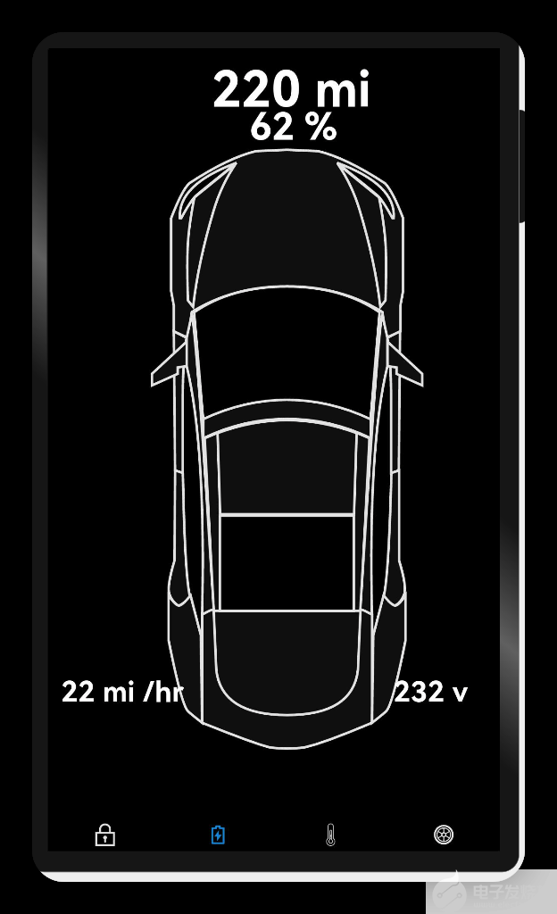
电池页
@
Entry
@
Component
export
default
struct
Battery
{
//电池页
build
() {
Column
() {
Stack
() {
Image
(
$r
(
"app.media.Car"
))
.
width
(
"100%"
)
.
height
(
"80%"
)
.
objectFit
(
ImageFit
.
Contain
)
.
margin
({
left
:
20
,
top
:
150
,
bottom
:
300
})
Text
(
"220 mi"
).
fontColor
(
Color
.
White
).
fontWeight
(
FontWeight
.
Bold
).
fontSize
(
79
).
position
({
x
:
260
,
y
:
20
})
Text
(
"62 %"
).
fontColor
(
Color
.
White
).
fontWeight
(
FontWeight
.
Bold
).
fontSize
(
60
).
position
({
x
:
320
,
y
:
90
})
Text
(
"22 mi /hr"
).
fontColor
(
Color
.
White
).
fontWeight
(
FontWeight
.
Bold
).
fontSize
(
45
).
position
({
x
:
20
,
y
:
1000
})
Text
(
"232 v"
).
fontColor
(
Color
.
White
).
fontWeight
(
FontWeight
.
Bold
).
fontSize
(
45
).
position
({
x
:
550
,
y
:
1000
})
}
.
backgroundColor
(
Color
.
Black
)
.
width
(
"100%"
)
.
height
(
"100%"
)
}
}
}
效果演示:
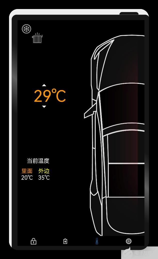
空调页
@
Entry
@
Component
export
default
struct
Temp
{
//空调页
build
() {
Column
() {
Stack
() {
Image
(
$r
(
"app.media.Car"
))
.
width
(
"100%"
)
.
height
(
"100%"
)
.
objectFit
(
ImageFit
.
Contain
)
.
position
({
x
:
268
,
y
:
90
})
.
margin
({
left
:
20
})
Image
(
$r
(
"app.media.Hot_glow_4"
))
.
width
(
"90%"
)
.
height
(
"90%"
)
.
objectFit
(
ImageFit
.
Contain
)
.
position
({
x
:
220
,
y
:
90
})
.
margin
({
left
:
20
})
Text
(
"29"
+
"\u2103"
,).
fontSize
(
90
).
fontColor
(
Color
.
Orange
).
position
({
x
:
90
,
y
:
400
})
Image
(
$r
(
"app.media.arrow_drop_up"
))
.
width
(
60
)
.
height
(
60
)
.
position
({
x
:
120
,
y
:
360
})
Image
(
$r
(
"app.media.arrow_drop_down"
))
.
width
(
60
)
.
height
(
60
)
.
position
({
x
:
120
,
y
:
480
})
Image
(
$r
(
"app.media.cool"
)).
width
(
60
).
height
(
60
).
position
({
x
:
20
,
y
:
40
})
Image
(
$r
(
"app.media.heating"
))
.
width
(
60
)
.
height
(
60
)
.
position
({
x
:
80
,
y
:
90
})
.
borderRadius
(
7
)
.
margin
({
right
:
40
})
Column
() {
Text
(
"当前温度"
).
fontSize
(
32
).
fontColor
(
Color
.
White
).
margin
({
bottom
:
20
})
Row
({
space
:
30
}) {
Column
() {
Text
(
"里面"
).
fontSize
(
32
).
fontColor
(
Color
.
Orange
)
Text
(
"20"
+
"\u2103"
,).
fontSize
(
32
).
fontColor
(
Color
.
White
)
}
Column
() {
Text
(
"外边"
).
fontSize
(
32
).
fontColor
(
Color
.
Yellow
)
Text
(
"35"
+
"\u2103"
,).
fontSize
(
32
).
fontColor
(
Color
.
White
)
}
}
}.
position
({
x
:
20
,
y
:
800
})
}
.
backgroundColor
(
Color
.
Black
)
.
offset
({
y
:
-
20
})
.
width
(
"100%"
)
.
height
(
"100%"
)
}
}
}
效果演示:
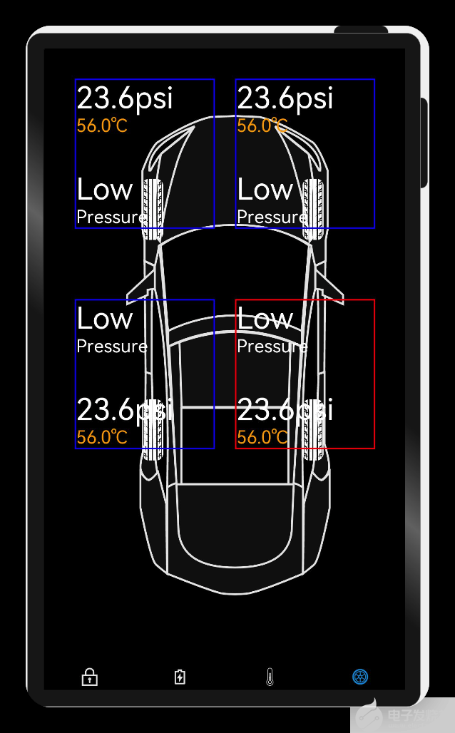
轮胎页
import
{
TyrePsiCard
}
from
'./tyre_psi_card'
@
Entry
@
Component
export
default
struct
Tyre
{
//轮胎页
build
() {
Column
() {
Stack
() {
Image
(
$r
(
"app.media.Car"
))
.
width
(
"100%"
)
.
height
(
"80%"
)
.
objectFit
(
ImageFit
.
Contain
)
.
margin
({
left
:
20
})
Image
(
$r
(
"app.media.FL_Tyre"
))
.
width
(
"10%"
)
.
height
(
"10%"
)
.
objectFit
(
ImageFit
.
Contain
)
.
position
({
x
:
180
,
y
:
700
})
Image
(
$r
(
"app.media.FL_Tyre"
))
.
width
(
"10%"
)
.
height
(
"10%"
)
.
objectFit
(
ImageFit
.
Contain
)
.
position
({
x
:
500
,
y
:
700
})
Image
(
$r
(
"app.media.FL_Tyre"
))
.
width
(
"10%"
)
.
height
(
"10%"
)
.
objectFit
(
ImageFit
.
Contain
)
.
position
({
x
:
500
,
y
:
260
})
Image
(
$r
(
"app.media.FL_Tyre"
))
.
width
(
"10%"
)
.
height
(
"10%"
)
.
objectFit
(
ImageFit
.
Contain
)
.
position
({
x
:
180
,
y
:
260
})
TyrePsiCard
({
x
:
60
,
y
:
60
,
boardColor
:
Color
.
Blue
})
TyrePsiCard
({
x
:
380
,
y
:
60
,
boardColor
:
Color
.
Blue
})
TyrePsiCard
({
x
:
60
,
y
:
500
,
boardColor
:
Color
.
Blue
,
isBottomTwoTyre
:
false
})
TyrePsiCard
({
x
:
380
,
y
:
500
,
isBottomTwoTyre
:
false
})
}
.
backgroundColor
(
Color
.
Black
)
.
width
(
"100%"
)
.
height
(
"100%"
)
}
}
}
效果演示:
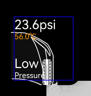
轮胎参数
/**
* 轮胎详细信息
*/
@
Entry
@
Component
export
struct
TyrePsiCard
{
private
text
:
string
=
''
private
x
:
number
=
0
private
y
:
number
=
0
private
boardColor
:
Color
=
Color
.
Red
private
isBottomTwoTyre
:
boolean
=
true
;
build
() {
Column
() {
if
(
this
.
isBottomTwoTyre
) {
Text
(
"23.6psi"
,).
fontSize
(
60
)
.
fontColor
(
Color
.
White
).
margin
({
right
:
60
})
Text
(
"56.0\u2103"
).
fontSize
(
36
)
.
fontColor
(
Color
.
Orange
).
margin
({
bottom
:
70
})
Text
(
"Low"
).
fontSize
(
60
)
.
fontColor
(
Color
.
White
)
Text
(
"Pressure"
).
fontSize
(
36
)
.
fontColor
(
Color
.
White
)
}
else
{
Text
(
"Low"
).
fontSize
(
60
).
margin
({
right
:
60
})
.
fontColor
(
Color
.
White
)
Text
(
"Pressure"
).
fontSize
(
36
)
.
fontColor
(
Color
.
White
).
margin
({
bottom
:
70
})
Text
(
"23.6psi"
,).
fontSize
(
60
)
.
fontColor
(
Color
.
White
)
Text
(
"56.0\u2103"
).
fontSize
(
36
)
.
fontColor
(
Color
.
Orange
)
}
}
.
border
({
width
:
3
,
color
:
this
.
boardColor
})
.
width
(
280
)
.
justifyContent
(
FlexAlign
.
Start
)
.
alignItems
(
HorizontalAlign
.
Start
)
// .padding({ left: 10, bottom: 20, top: 20 })
.
position
({
x
:
this
.
x
,
y
:
this
.
y
})
}
}
效果演示:
恭喜你
在本文中,通过实现智联汽车App示例,我主要为大家讲解了如下ArkUI(基于TS扩展的类Web开发范式)组件
容器组件
Column
Row
Stack
基础组件
Text
TextInput
Button
Image
Navigation
通用
边框设置
尺寸设置
点击控制
布局约束
背景设置
点击事件
TS语法糖
希望通过本教程,各位开发者可以对以上基础组件具有更深刻的认识。
后面的计划:
一键启动
硬件交互
动画交互
-
开发板
+关注
关注
25文章
6127浏览量
113465 -
智能汽车
+关注
关注
30文章
3231浏览量
109151 -
智慧出行
+关注
关注
0文章
129浏览量
8144 -
HarmonyOS
+关注
关注
80文章
2146浏览量
35589 -
OpenHarmony
+关注
关注
31文章
3926浏览量
20725 -
鸿蒙智联
+关注
关注
0文章
30浏览量
681
发布评论请先 登录
如何实现DAYU200开发板使能Panfrost驱动并且支持OpenHarmony呢
基于润和DAYU200开发套件的OpenHarmony分布式音乐播放器
【每日精选】开源鸿蒙系统DAYU200教程及Tina Wi-Fi模组移植
OpenHarmony 3.1 Release初体验 润和DAYU200开发套件
润和DAYU200领跑OpenHarmony富设备产业化!
【润和软件DAYU200开发板体验】润和软件DAYU200开发板开箱篇
【润和软件DAYU200开发板体验】终于Helloworld!!
【润和软件DAYU200开发板体验】移植speexdsp到OpenHarmony标准系统功能演示
OpenHarmony Dev-Board-SIG专场:DAYU200开源计划—代码上Master需要的材料
DAYU200开发版升级openHarmony3.1 release版本
润和软件开发板DAYU200 支持富设备开发 OpenHarmony开发者都选它
【润和软件DAYU200开发板体验】润和软件DAYU200开发板开箱篇
喜大普奔!DAYU200能打电话了—OpenHarmony 3.1新特性!

润和软件DAYU200的OpenHarmony赋能之旅


 工商网监
工商网监
评论